Train5D · Chapter 2
186 directions.
One right answer.
The design wasn't planned — it was found. Every feature area was explored across multiple directions before anything was committed. These are the prototypes: the wrong turns, the dead ends, and the iterations that got there.
186
Explorations total
3–5
Directions per feature
0
Production code before design was settled
"The first prototype is never the answer. It's the question."
The process started with the dashboard — because if that's where the user lands every day, it has to feel right before anything else gets built. The first version wasn't designed to be used. It was designed to be wrong in an interesting way.
Every direction asked a different question. Should the user see their program first, or their check-in status? Should the layout surface what they did, or what they should do next? Is more information more helpful, or more overwhelming?
None of those questions were answered by talking about them. They were answered by building prototype after prototype and looking at them side by side.
That's how 186 explorations happened. Not from scope creep — from a commitment to not committing too early. Each prototype eliminated a direction, sharpened the criteria, or revealed something the previous one hadn't shown.
By the time production code started, every major design decision had already been made and tested in the browser.
01
Start with the question
What does this person need to feel, not just do? Define the problem before touching a tool.
02
Build 3–5 directions
Each direction explores a different UX philosophy — not variations on one idea. Fast, rough, intentional HTML prototypes.
03
Compare in the browser
Real browser, real interactions. Decisions made from live behavior, not static mockups.
04
Decide with evidence
One direction moves forward. Every choice is defensible. The others stay as reference.
Feature Area 01 — Dashboard
The question that took the longest to answer
The dashboard is where the user starts every single day. Getting it wrong meant getting everything wrong. Seven major versions, each one built on what the last one revealed. The final design emerged from this progression — not from the first idea.
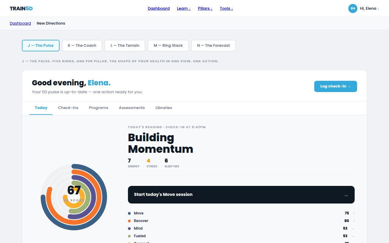
Overview
All directions, side by side
The full decision board — every dashboard direction laid out for comparison before committing to one.
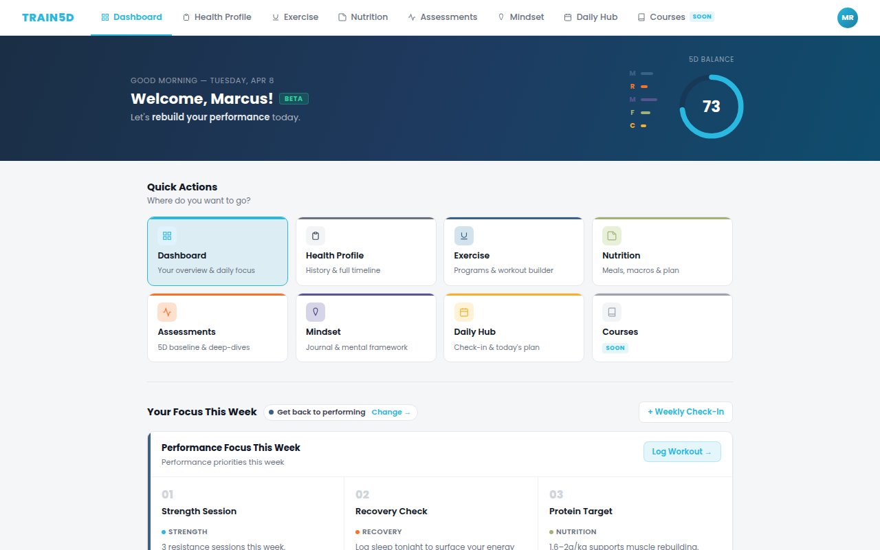
Version 2
Early structure
First attempt at organizing the daily flow. Too much at once.
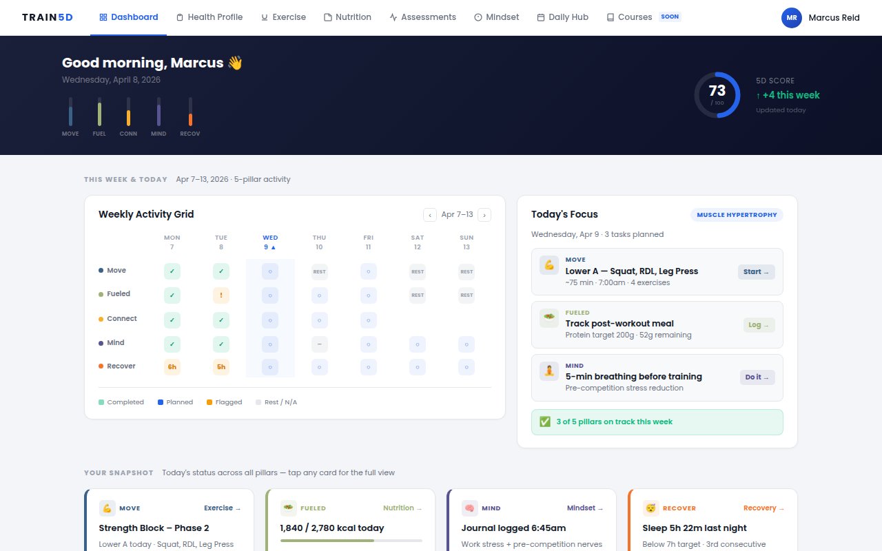
Version 3
Simplified focus
Pulled back. One action at a time. Cleaner but lost context.
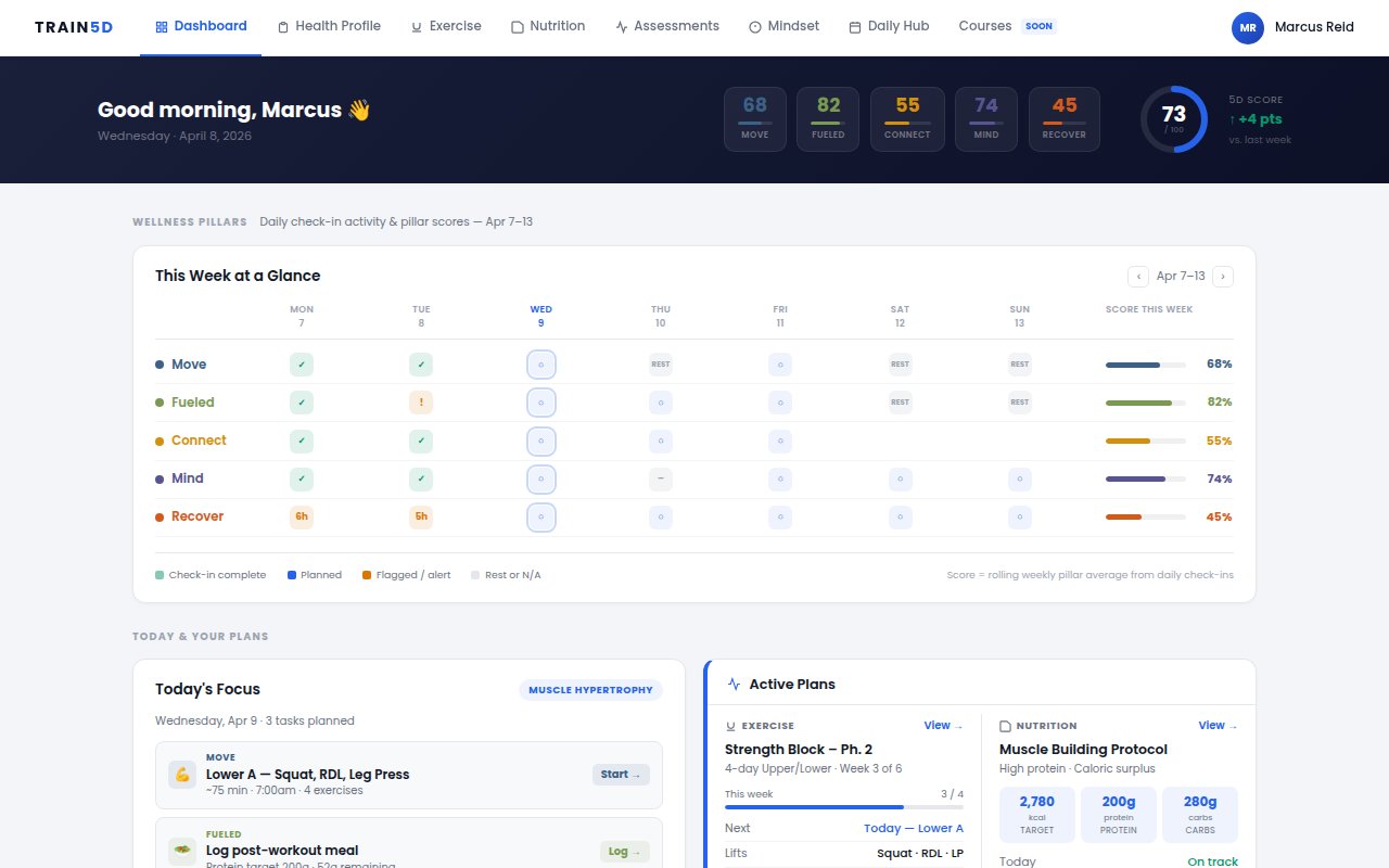
Version 4
Pillar-first layout
Surfacing all five pillars upfront. The visual language started taking shape here.
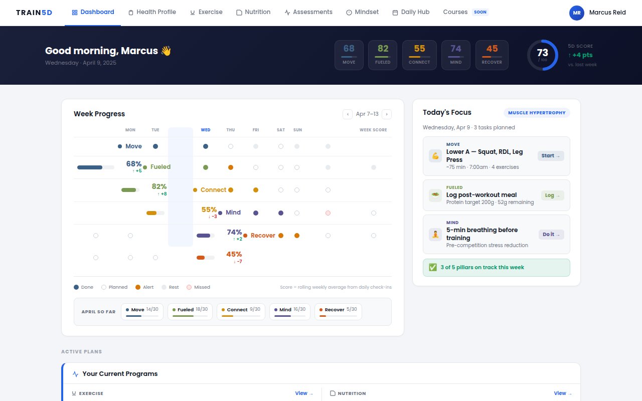
Version 6
Daily flow model
Shifted from pillars to time — RISE through WIND-DOWN. The structure that stuck.
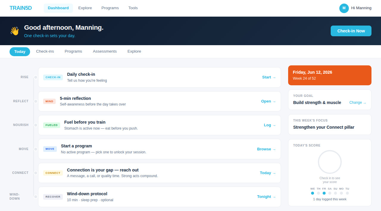
Final
The shipped dashboard
Greeting, daily flow, sidebar. Everything the earlier versions taught, resolved into one layout.
Feature Area 02 — Nutrition
Four completely different answers to the same problem
Nutrition tracking is where most fitness apps lose users — it's either too clinical or too vague. Four UX philosophies, each built as a real prototype. The goal wasn't to pick the best one from a list. It was to understand what each approach actually felt like to use.
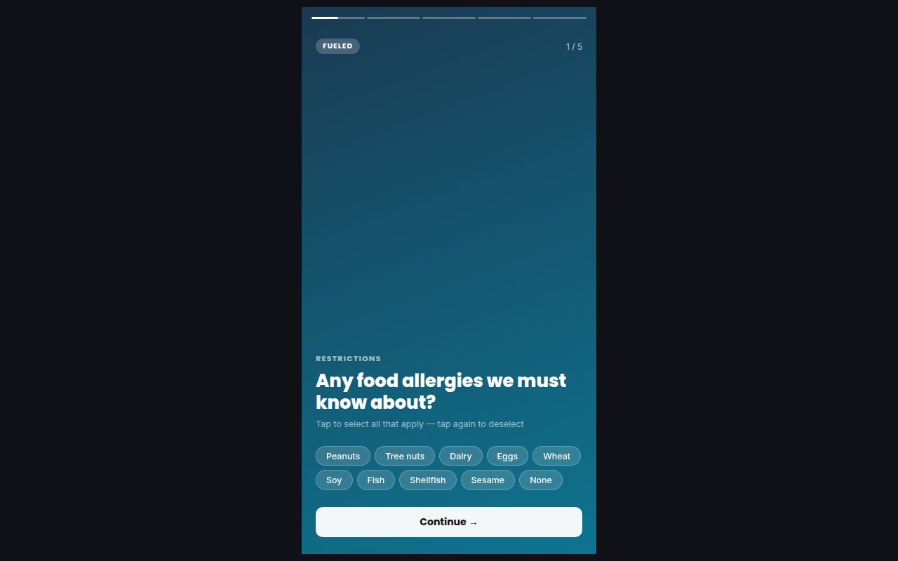
Direction A
Stories — ephemeral logging
Disappearing meals. Low-pressure, social-native interaction that removes the clinical weight of tracking.
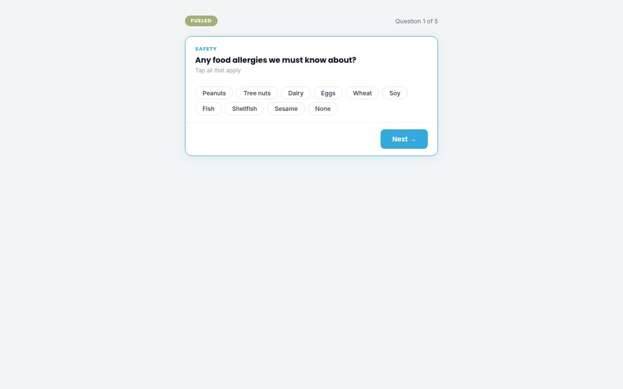
Direction B
Receipt log — familiar model
Nutrition as a receipt: items, quantities, totals. A mental model people already know.
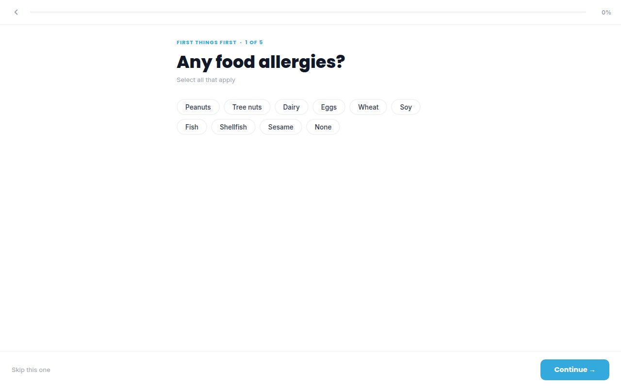
Direction C
Bold visual — progress as reward
Macro rings, bold type, visual payoff. For users motivated by watching numbers move.
Direction D
Coach-driven — conversational
Accountability-first. The app asks, you answer. Closest to how an actual coach would engage.
Feature Area 03 — Programs & Daily View
Where the five pillars had to actually work together
Programs and the daily view were the hardest to get right because they had to connect multiple pillars at once. A program isn't just a workout schedule — it's a system that accounts for recovery, fuel, and readiness. These prototypes were where that interdependence got stress-tested.
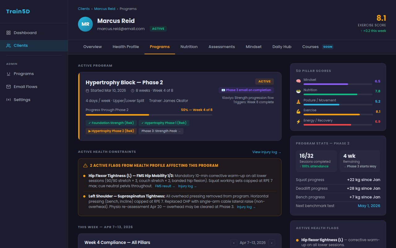
Programs
Program browser
Discovering and selecting a program. Filtering by goal, pillar focus, and duration.
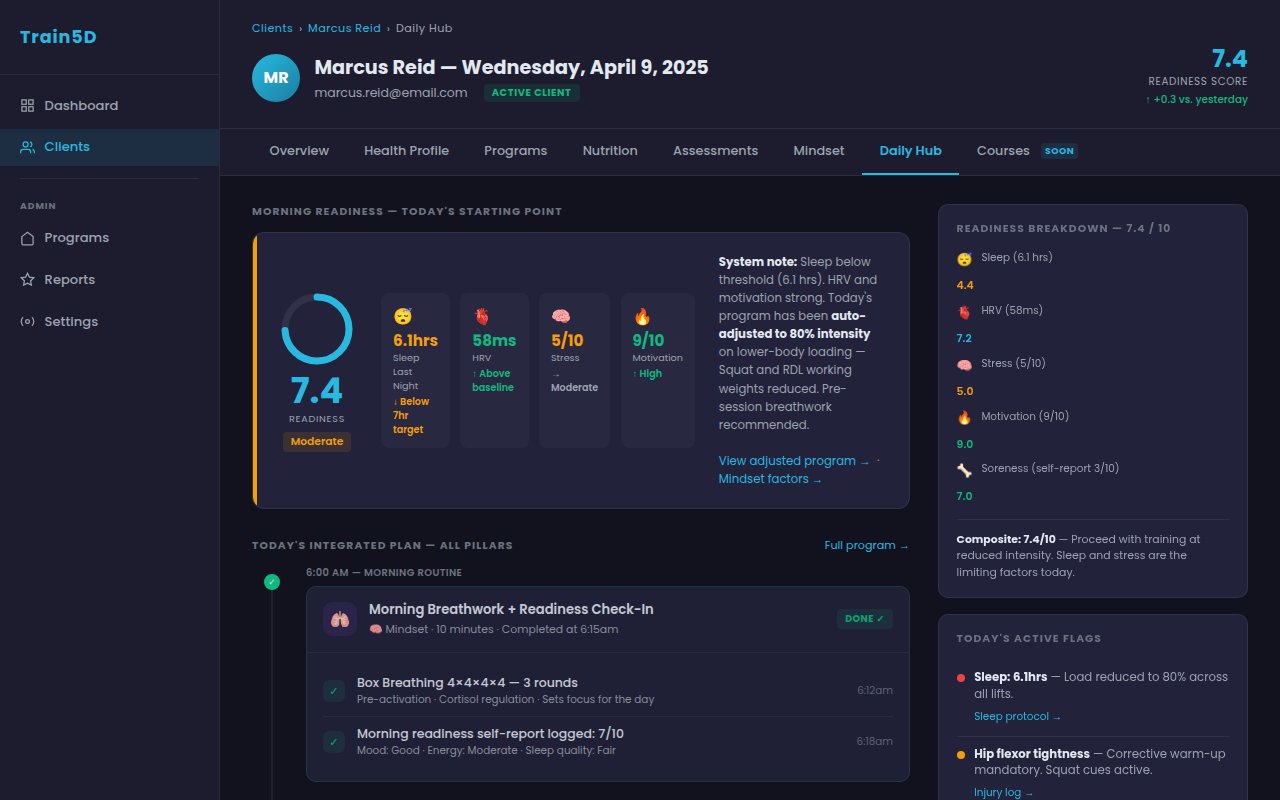
Daily View
Today screen
What the user sees on an active program day. Session, check-in, pillar context — all in one view.
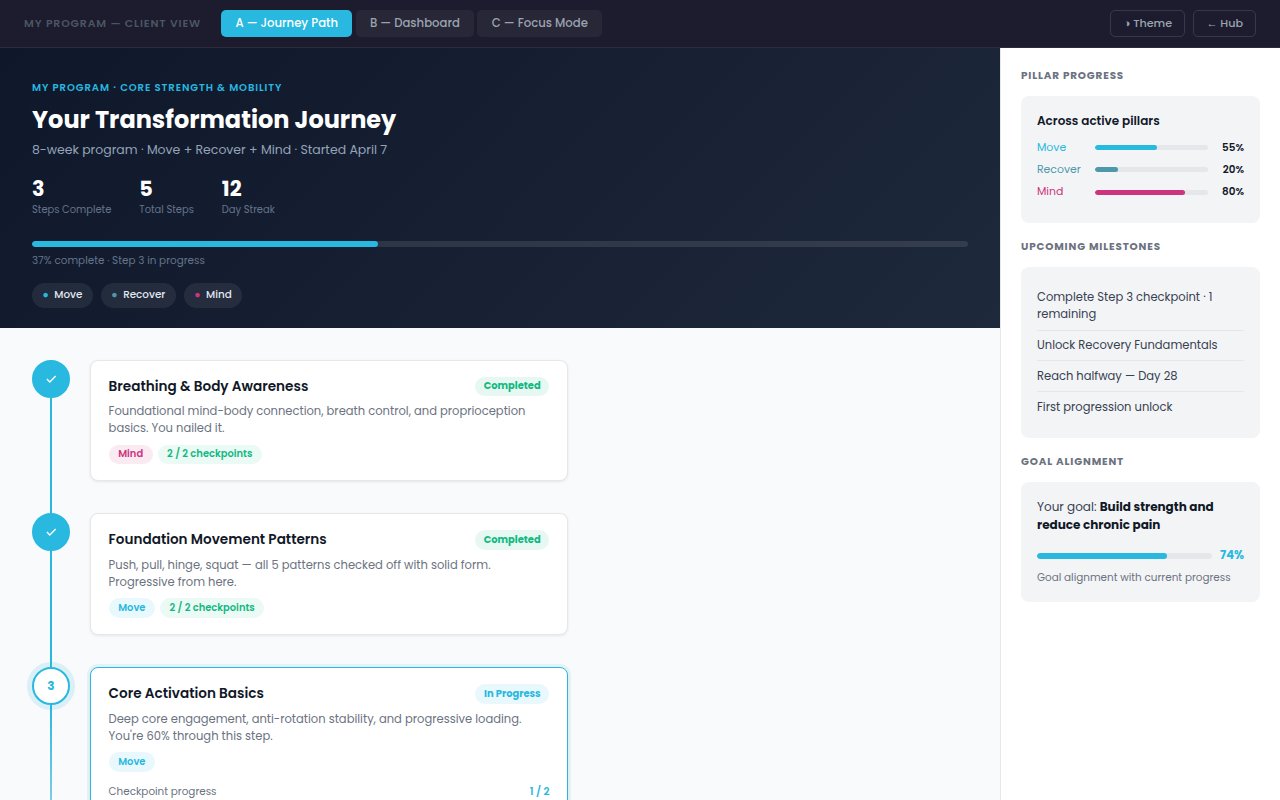
My Program
Program progress view
The user's active program — week by week, session by session. Progress without overwhelming detail.
Up next — Chapter 3
186 explorations eventually collapse into rules. That's the design system.
See the Design System →